By Eric Vandenbroeck and
co-workers
The logic of human nature and causal networks
In addition to our earlier comment, John Mark
Bishop recently
wrote Artificial Intelligence is stupid and causal reasoning will not fix
it. So the question is why.
As ear correlation
means that there is a relationship, or pattern, between two different
variables, but it does not tell us the nature of the relationship between
them. In contrast, causation implies that beyond there being a
relationship between two events, one event causes another event to occur.
As early on explained
by Thomas Sowell, the concept of causation and its contrast with mere
correlation is the lifeblood of science. What causes cancer? Or climate change?
Or schizophrenia? It is woven into our everyday language, reasoning, and humor.
The semantic contrast between “The ship sank” and “The ship was sunk” is
whether the speaker asserts that there was a causal agent behind the event
rather than a spontaneous occurrence. We appeal to causality whenever we ponder
what to do about a leak, a draft, an ache or a pain.
What Is Correlation?
A correlation is a dependence of the value of one variable on the importance of
another: if you know one, you can predict the other, at least approximately.
(“Predict” here means “guess,” not “foretell”; you can expect the height of parents
from the heights of their children or vice versa.
In 2020 Jeff Bezos
claimed, All of my best decisions in business and life have been made with heart,
intuition, gut, not analysis, implying that heart and guts lead to better
decisions than analysis. But he did not tell us whether all of his worst decisions
in business and life were also made with heart, intuition, and guts, nor
whether the good gut decisions and bad analytic ones outnumbered the bad gut
decisions and good analytic ones.
Illusory correlation,
as this fallacy is called, was first demonstrated in a famous set of
experiments by the psychologists Loren and Jean Chapman, who wondered why so
many psychotherapists still used the Rorschach inkblot and Draw-a-Person tests
even though
every study that had ever tried to validate them showed no correlation
between responses on the tests and psychological symptoms. The experimenters
mischievously paired written descriptions of psychiatric patients with their
reactions on the Draw-a-Person test, but in fact, the descriptions were fake
and the pairings were random. They then asked a sample of students to report
any patterns they saw across the pairs. The students, guided by their
stereotypes, incorrectly estimated that hyper-masculine patients sketched more
broad-shouldered men. More wide-eyed ones came from hyper-masculine patients
drew more broad-shouldered claims to see in their patients, with as little
basis in reality.
A bored law student,
Tyler Vigen, wrote
a program that scrapes the web for datasets with meaningless correlations
to show how prevalent they are. The number of murders by steam or hot objects,
for example, correlates highly with the age of the reigning Miss America. And
the divorce rate in Maine closely tracks the national consumption of
margarine.
Galton’s family heights data revisited
“Regression” has
become the standard term for correlational analyses, but the connection is
roundabout. The term initially referred to a specific phenomenon that comes
along with correlation, regression to the mean. This ubiquitous but
counterintuitive phenomenon was discovered by the Victorian polymath Francis
Galton (1822–1911), who plotted the
heights of children against the average size of their two parents (the
“mid-parent” score, halfway between the mother and the father) in both cases
adjusting for the average difference between males and females. He found that
“when mid-parents are taller than mediocrity, their children tend to be shorter
than they. When mid-parents are shorter than mediocrity, their children tend to
be taller than they.” It’s still true, not just of the heights of parents and
their children, but of the IQs of parents and their children, and for that
matter, of any two variables that are not perfectly correlated. An extreme
value in one will tend to be paired with a not-quite-as-extreme value in the
other.
This does not mean
that tall families are begetting shorter and shorter children and vice versa so
that someday all children will line up against the same mark on the wall and
the world will have no jockeys or basketball centers. Nor does it mean that the
population is converging on a middlebrow IQ of 100, with geniuses and dullards
going extinct. People don’t collapse into uniform mediocrity, despite
regression to the mean, because the tails of the distribution are constantly
being replenished by the occasional very tall child of taller-than-average
parents and very short child of shorter-than-average ones.
Regression to the
mean is a statistical phenomenon because, in bell-shaped distributions, the
more extreme a value is, the less likely it is to turn up. That implies that
any other variable is unlikely to live up to its weirdness, or duplicate its
winning streak, or suffer from the same run of bad luck, or even the same
perfect storm, again, and will backslide toward ordinariness. For height or IQ,
the freakish conspiracy would be whatever unusual combination of genes,
experiences, and accidents of biology came together in the parents. Many of the
components of that combination will be favored in their children, but the
combination itself will not be perfectly reproduced. (And vice versa: because
regression is a statistical phenomenon, not a causal one, parents regress to
their children’s mean, too.)
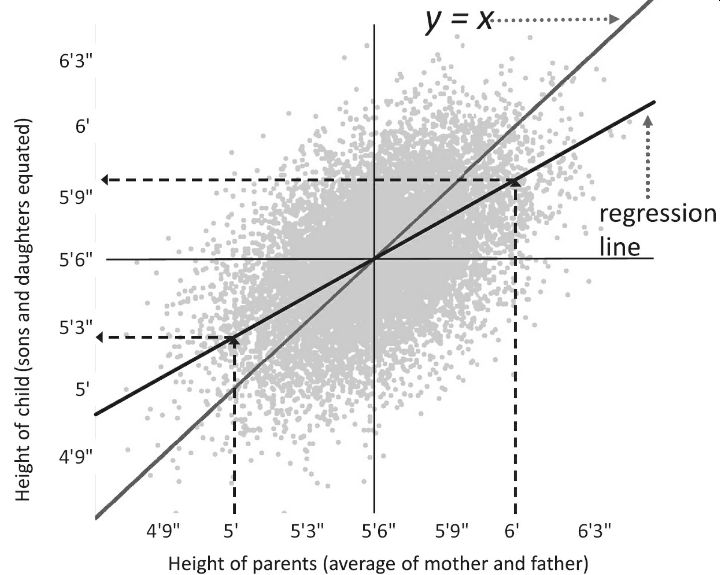
In the above graph,
we have a hypothetical dataset similar to Galton’s showing the heights of
parents (the average of each couple) and the heights of their adult children
(adjusted so that the sons and daughters can be plotted on the same scale). The
gray 45-degree diagonal shows what we would expect on average if children were
exactly as exceptional as their parents. The black regression line is what we
find in reality. If you zero in on an extreme value, say, parents with an
average height between them of 6 feet, you’ll find that the cluster of points
for their children mostly hangs below the 45-degree diagonal, which you can
confirm by scanning up along the right dotted arrow to the regression line,
turning left, and following the horizontal dotted arrow to the vertical axis,
where it points a bit above 5′9″, shorter than the parents. If you zero in on
the parents with an average height of 5 feet (left dotted arrow), you’ll see
that their children mostly float above the gray diagonal, and the left turn at the
regression line takes you to a value of almost 5′3″, taller than the parents.
Regression to the
mean happens whenever two variables are imperfectly correlated, which means
that we have a lifetime of experience with it. Nonetheless, Tversky and Kahneman have
shown that most people are oblivious to the phenomenon.
Unawareness of
regression to the mean sets the stage for many other illusions. After a spree
of horrific crimes is splashed across the papers, politicians intervene with
SWAT teams, military equipment, Neighborhood Watch signs, and other gimmicks,
and sure enough, the following month they congratulate themselves because of
the crime rate is not as high. Psychotherapists, too, regardless of their
flavor of talking cure, can declare unearned victory after treating a patient
who comes in with a bout of severe anxiety or depression.
Another cause of
replication failures is that experimenters don’t appreciate a regression
version to the mean called the Winner’s Curse. It’s frequently observed in
auctions: The person who bids the most and wins may regret the bid since it
often exceeds the value of the auctioned object.
That is if the
results of an experiment seem to show an interesting effect, a lot of things
must have gone right, whether
the effect is real or not. A failure to appreciate how regression to the
mean applies to striking discoveries led to a muddled 2010 New Yorker article
called “The Truth Wears Off,” which posited a mystical “decline effect,”
supposedly casting doubt on the scientific method.
The Winner’s Curse
applies to any unusually successful human venture, and our failure to
compensate for singular moments of good fortune may be one of the reasons that
life so often brings disappointment.
The problem with causation
Even once we have
established that some cause makes a difference to an outcome, neither
scientists nor laypeople are content to leave it at that. We connect the cause
to its effect with a mechanism: the clockwork behind the scenes that push
things around. People have intuitions that the world is not a video game with
patterns of pixels giving way to new patterns. Underneath each happening is a
hidden force, power, or oomph. Many of our primitive intuitions of causal
powers turn out, in the light of science, to be mistaken, such as the “impetus”
that the medievals thought was impressed upon moving
objects, and the psi, qi, engrams, energy fields, homeopathic miasms, crystal powers, and other bunkum of alternative
medicine. But some intuitive mechanisms, like gravity, survive in
scientifically respectable forms. And many new hidden mechanisms have been
posited to explain correlations in the world, including genes, pathogens,
tectonic plates, and elementary particles. These causal mechanisms are what
allow us to predict what would happen in counterfactual scenarios, lifting them
from the realm of make-believe: we set up the pretend world and then simulate
the mechanisms, which take it from there.
Identifying the cause
of an effect raises a thicket of puzzles. When something happens, people
commonly ask: What caused that? Making causal judgments is often deceptively
easy. We naturally conclude that the lightning strike caused the forest fire,
or the scandal caused the political candidate’s defeat. These kinds of causal
judgments are also very important, structuring how we understand and interact
with our environments.
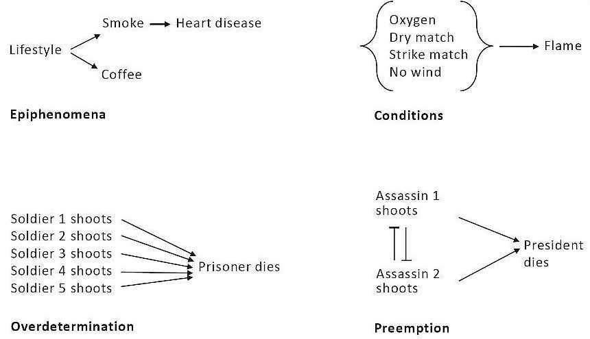
Identifying the cause
of an effect is challenging. One difference between a cause and a condition is
elusive. We say striking a match causes a fire, but without oxygen, there would
be no fire. Why don’t we say “The oxygen caused the fire”?
Preemption overdetermination
and probabilistic causation
A second puzzle is a
preemption. Suppose, for the sake of argument, that Lee Harvey Oswald had a
co-conspirator perched on the grassy knoll in Dallas in 1963, and they had
conspired that whoever got the first clear shot would take it while the other
melted into the crowd. In the counterfactual world in which Oswald did not
shoot, JFK would still have died, yet it would be wacky to deny that in the
world in which he did take the shot before his accomplice, he caused Kennedy’s
death.
A third is an
overdetermination. A condemned prisoner is shot by a firing squad rather than a
single executioner so that no shooter has to live with the dreadful burden of
being the one who caused the death: if he had not fired, the prisoner would
still have died. But then, by the logic of counterfactuals, no one caused his
death.
And then there’s
probabilistic causation. Many of us know a nonagenarian who smoked a pack a day
all her life. But nowadays few people would say that her ripe old age proves
that smoking does not cause cancer, though that was a typical “refutation” in
the days before the smoking–cancer link became undeniable. Even today, the
confusion between less-than-perfect causation and no causation is rampant. A
2020 New York Times op-ed argued for abolishing the police because “the current
approach hasn’t ended [rape]. Most rapists never see the inside of a
courtroom.” The
editorialist did not consider whether, if there were no police, even fewer
rapists, or none at all, would see the inside of a courtroom.
We can make sense of
these paradoxes of causation only by forgetting the billiard balls and
recognizing that no event has a single cause. Events are embedded in a network
of causes that trigger, enable, inhibit, prevent, and supercharge one another
in linked and branching pathways. The four causal puzzlers become less puzzling
when we lay out the road maps of causation in each case, shown below.
If you interpret the
arrows not as logical implications (“If X smokes, then X gets heart disease”)
but as conditional probabilities (“The likelihood of X getting heart disease
given that X is a smoker is higher than the likelihood of X getting heart disease
given that he is not a smoker”), and the event nodes not as being either on or
off but as probabilities, reflecting a base rate or prior, then the diagram is
called a causal Bayesian
network.
One can work out what
unfolds over time by applying (naturally) Bayes’s
rule, node by node through the network. No matter how convoluted the tangle of
causes, conditions, and confounds, one can then determine which events are
causally dependent on or independent of one another:
The inventor of these
networks, the computer scientist Judea
Pearl, notes that they are built out of three simple patterns, the chain, the
fork, and the collider, each capturing a fundamental (but unintuitive) feature
of causation with more than one cause.
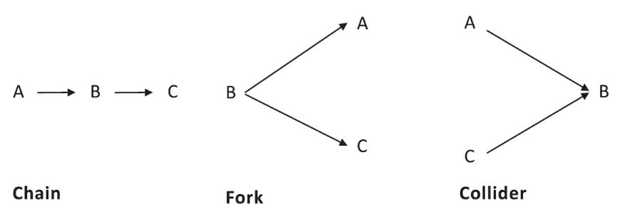
The connections
reflect the conditional probabilities. In each case, A and C are not directly
connected, which means that the probability of A given B can be specified
independently of the probability of C given B. And in each case, something
distinctive may be said about the relation between them.
In a causal chain,
the first cause, A, is “screened off” from the ultimate effect, C; its only
influence is via B. As far as C is concerned, A might as well not exist.
Consider a hotel’s fire alarm, set off by the chain “fire → smoke → alarm.”
It’s not a fire alarm but a smoke alarm, indeed, a haze alarm. The guests may
be awakened as readily by someone spray-painting a bookshelf near an intake
vent as by an errant crème brûlée torch.
A causal fork is
already familiar: it depicts a confound or epiphenomenon, with the attendant
danger of misidentifying the actual cause. Age affects vocabulary (B) and shoe
size (C), since older children have bigger feet and know more words. This means
that vocabulary is correlated with shoe size. Head Start should not prepare
children for school by fitting them with larger sneakers.
Just as dangerous is
the collider, where unrelated causes converge on a single effect. Actually,
it’s even more dangerous, because while most people intuitively get the fallacy
of a confound (it cracked them up in the shtetl), the “collider stratification
selection bias” is almost unknown. The trap in a causal collider is that when
you focus on a restricted range of effects, you introduce an artificial
negative correlation between the causes since one cause will compensate for the
other. Many veterans of the dating scene wonder why good-looking men are jerks.
But this may be a calumny on the handsome, and it’s a waste of time to cook up
theories to explain it, such as that good-looking men have been spoiled by a
lifetime of people kissing up to them. Many women will date a man (B) only if
he is either attractive (A) or nice (C). Even if niceness and looks were
uncorrelated in the dating pool, the plainer men had to be nice or the woman
would never have dated them in the first place, while any such filter did not
sort the hunkser. Such a filter introduced a bogus
negative correlation that did not sort the critics of standardized testing into
thinking that test scores don’t matter, based on the observation that graduate
students admitted with higher scores are no more likely to complete the
program. The problem is that the students who were accepted despite their low
scores must have boasted other assets. If one is unaware of the bias, one could
even conclude that maternal smoking is good for babies, since among babies with
low birth weights, the ones with mothers who smoked are healthier. That’s
because low birth weight must be caused by something, and the other possible
causes, such as alcohol or drug abuse, maybe even more harmful to the child.
The collider fallacy also explains why Jenny Cavilleri
unfairly maintained that rich boys are stupid: to get into Harvard (B), you can
be either rich (A) or smart (C).
The problem is that
when one thing is correlated with another, it does not necessarily mean that
the first caused the second. As the mantra goes: When A is correlated with B,
it could mean that A causes B, B causes A, or some third factor, C, causes both
A and B. Reverse causation and confounding, the second and third verses of the
mantra, are ubiquitous. The world is a substantial causal Bayesian network,
with arrows pointing everywhere, entangling events into knots where everything
is correlated with everything else.
Causal conclusions
Countries that are
richer also tend to be healthier, happier, safer, better educated, less
polluted, more peaceful, more democratic, more liberal, more secular, and more
gender-egalitarian. People who are richer also tend to be healthier, better
educated, better connected, likelier to exercise and eat well, and likelier to
belong to privileged groups. These snarls mean that almost any causal
conclusion you draw from correlations across countries or across people is
likely to be wrong, or at best unproven. Does democracy make a country
more peaceful because its leader can’t readily turn citizens into cannon
fodder? Or do countries facing no threats from their neighbors have the luxury
of indulging in democracy? Does going to college equip you with skills that
allow you to earn a good living? Or do only intelligent, disciplined, or
privileged people, who can translate their natural assets into financial ones,
make it through university?
There is an
impeccable way to cut these knots: the randomized
experiment often called a randomized controlled trial or RCT. Take a large
sample from the population of interest, randomly divide them into two groups,
apply the putative cause to one gro, withhold it from
the other, and see if the first group changes while the second does not. A
random withhold is the closest we can come to creating the counterfactual world
that is the acid test for causation. A causal network consists of surgically
severing the putative cause from all its incoming influence, setting it to
deterrent values and seeing whether the probabilities of the putative effects
differ.
Randomness is the
key: if the patients who were given the drug signed up earlier, or lived closer
to the hospital, or had more interesting symptoms, than the patients who were
given the placebo, you’ll never know whether the drug worked. The wisdom of randomized
controlled trials is seeping into policy, economics, and education. Recently referred to as Freakonomics they are
urging policymakers to test their nostrums in one set of randomly selected
villages, classes, or neighborhoods, and compare the results against a control
group that is put on a waitlist or given some meaningless make-work program.
The knowledge gained
is likely to outperform traditional ways of evaluating policies, like dogma,
folklore, conventional wisdom, and HiPPO. Randomized
experiments are no panacea since nothing is a panacea. Laboratory scientists
snipe at each other as much as correlational data scientists, because even in
an experiment you can’t do just one thing. Experimenters may think they have
administered treatment only to the experimental group, but other variables may
be confounded with it.
The other problem
with experimental manipulations, of course, is that the world is not a
laboratory. It’s not as if political scientists can flip a coin, impose
democracy on some countries and autocracy on others, and wait five years to see
which ones go to war. The same practical and ethical problems apply to studies
of individuals, as shown in this cartoon. Michael Shaw/The New Yorker
Collection/The Cartoon Bank Though not everything can be studied in an
experimental trial, social scientists have mustered their ingenuity to find
instances in which the world does the randomization for them. These experiments
of nature can sometimes allow one to wring causal conclusions out of a
correlational universe. One example is the “regression
discontinuity.”
Palliatives for the ailments that enfeeble causal
inference
And whereby these
palliatives are not as good as the charm of random assignment, but often
they are the best we can do in a world that was not created for the benefit of
scientists. Reverse causation is the easier of the two to rule out, thanks to
the iron law that hems in the writers of science fiction and other time-travel
plots like Back to the Future: the future cannot affect the past. Suppose you
want to test the hypothesis that democracy causes peace, not just vice versa.
First, one must avoid the fallacy of all-or-none causation, and get beyond the
common but false claim that “democracies never fight each other” (there are
plenty of exceptions). The more realistic hypothesis is that countries that are
relatively more democratic are less likely to fall into war.
Several research
organizations give countries democracy
scores from –10 for a full autocracy like North Korea to +10 for a full democracy
like Norway. Peace is a bit harder because (fortunately for humanity, but
unfortunately for social scientists) shooting wars are uncommon, so most of the
entries in the table would be “0.”
Instead, one can
estimate war-proneness by the number of “militarized disputes” a country was
embroiled in over a year: the saber-rattlings,
alerting of forces, shots fired across bows, warplanes sent scrambling,
bellicose threats, and border skirmishes. One can convert this from a war score
to a peace score (so that more peaceful countries get higher numbers) by
subtracting the count from some large number, like the maximum number of
disputes ever recorded. Now one can correlate the peace score against the
democracy score. By itself, of course, that correlation proves nothing.
But suppose that each
variable is recorded twice, say, a decade apart. If democracy causes peace,
then the democracy score at Time 1 should be correlated with the peace score at
Time 2. This, too, proves little, because over a decade, the leopard doesn’t
change its spots: a peaceful democracy then may be a peaceful as a control one
can look to the o over a decade there diagonal: the correlation between
democracy (the democracy score) at Time 2 and Peace (the peace score) at Time
1. This correlation captures any reverse causation, together with the confounds
that have stayed put over the decade. If the first correlation (past cause with
present effect) is stronger than the second (past effect with present cause),
it’s a hint that democracy causes peace rather than vice versa. The technique
is called cross-lagged panel correlation, “panel” being argot for a dataset
containing measurements at several points in time.
Confounds, too, maybe
tamed by clever statistics. You may have read in science news articles of
researchers “holding constant” or “statistically controlling for” some
confounded or nuisance variable. The simplest way to do that is called
matching. The democracy–peace relationship is infested with plenty of
confounds, such as prosperity, education, trade, and membership in treaty
organizations. Let’s consider one of them, wealth, measured as GDP per capita.
Suppose that for every democracy in our sample we found an autocracy that had
the same GDP per capita. If we compare the average peace scores of the
democracies with their autocracy doppelgangers, we’d have an estimate of the
effects of democracy on peace, holding GDP constant. The logic of matching is straightforward,
but it requires a large pool of candidates from which to find suitable matches,
and the number explodes as more confounds have to be held constant. That can
work for an epidemiological study with tens of thousands of participants to
choose from, but not for a political study in a world with just 195 countries.
The more general
technique is called multiple regression, and it capitalizes on the fact that a
confound is never perfectly correlated with a putative cause. The discrepancies
between them turn out to be not bothersome noise but telltale information. Here’s
how it could work with democracy, peace, and GDP per capita. First, we plot the
putative cause, the democracy score, against the nuisance variable (top left
graph), one point per country. (The data are fake, made up to illustrate the
logic.) One fits the regression line, and turns one attention to the residuals:
the vertical distance between each point and the line, corresponding to the
discrepancy between how democratic a country would be if income predicted
democracy perfectly and how democratic it is in reality. Now we throw away each
country’s original democracy score and replace it with the residual: the
measure of how democratic it is, controlling for its income.
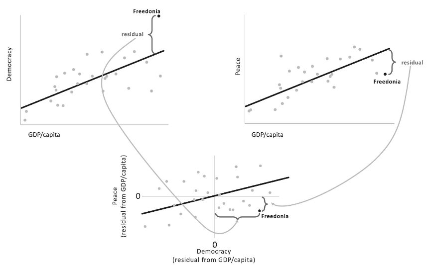
One can do the same
with the putative effect, peace. Here one plots the peace score against the
nuisance variable (top right graph), measures the residuals, throws away the
original peace data, and replaces them with the residuals, namely, how peaceful
each country is above and beyond what you would expect from its income. The
final step is obvious: correlate the Peace residuals with the Democracy
residuals (bottom graph). If the correlation is significantly different from
zero, one may venture that democracy causes peacefulness, holding prosperity
constant.
What one has then is
the core of the vast majority of statistics used in epidemiology and social
sciences, called the general linear model which
extends extent the traditional ordinary linear regressors.
The deliverable is an
equation that allows one to predict the effect from a weighted sum of the
predictors (some of them, presumably, causes). If you’re a good visual thinker,
you can imagine the prediction as a tilted plane, rather than a line, floating
above the ground defined by the two predictors. Any number of predictors can be
thrown in, creating a hyperplane in hyperspace; this quickly overwhelms our
feeble powers of visual imagery (which has enough trouble with three
dimensions), but in the equation, it consists only of adding more terms to the
string. In the case of peace, the equation might be: Peace = (a × Democracy) +
(b × GDP/capita) + (c × Trade) + (d × Treaty-membership) + (e × Education),
assuming that any of these five might be a pusher or a puller of peacefulness.
The regression analysis informs us which of the candidate variables pulls its
weight in predicting the outcome, holding each of the others constant. It is
not a turnkey machine for proving causation, one still has to interpret the variables
and how they are plausibly connected, and watch out for myriad traps, but it is
the most commonly used tool for unsnarling multiple causes and confounds.
Adding and Interact
The algebra of a
regression equation is less important than the big idea flaunted by its form:
events have more than one cause, all of them statistical. The idea seems
elementary, but it’s regularly flouted in public discourse. All too often,
people write as if every outcome had a single, unfailing cause: if A has been
shown to affect B, it proves that C cannot affect it. Accomplished people spend
ten thousand hours practicing their craft; this is said to show that
achievement is a matter of practice, not talent. Men today cry twice as often
as their fathers did; this indicates that the difference in crying between men
and women is social rather than biological. The possibility of multiple causes,
nature and nurture, talent and practice, is inconceivable. The idea of
interacting caus is even more elusivees:
the possibility that one cause may depend on another. Everyone benefits from
practice, but talented people benefit more. We need a vocabulary for talking
and thinking about multiple causes. This is another area in which a few simple
concepts from statistics can make everyone smarter. The revelatory concepts are
the main effect and interaction.
Thus suppose one is
interested in what makes monkeys fearful: heredity, namely the species they
belong to (capuchin or marmoset), or the environment in which they we
- Heredity.
- Namely with their mothers or in a large enclosure with parents
- The other monkey families).
Suppose we have a way
of measuring fear, how closely the monkey approaches a rubber snake. With two
Possible causes and
one effect, six diff things can happen. This doesn’t sound very easy, but the
possibilities jump off the page as soon as we plot them in graphs. Let’s start
with the three simplest ones.
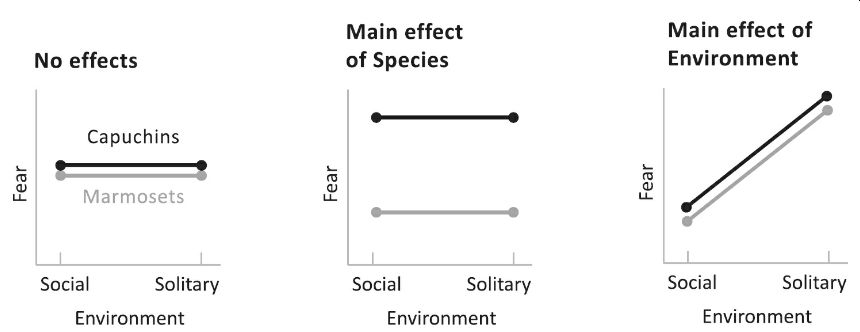
The left graph shows
a big fat nothing: a monkey is a monkey. Species doesn’t matter (the lines fall
on top of each other); Environment doesn’t matter either (each line is flat).
We would see the middle graphene if Species mattered (capuchins are more skittish
than marmosets, shown by their line floating higher on the graph). In contrast,
environment did not (both species are equally fearful whether they are raised
alone or with others, shown by each line being flat). There is a main effect of
Species, meaning that the effect is seen across the board, regardless of the
Species has the primary impact the opposite outcome.
We have three
possibilities for causes. What would it look like if Species and Environment
both mattered: if capuchins were innately more fearful than marmosets and if
being reared alone makes a monkey more fearful? The leftmost graph shows this
situation, with two main effects. The two lines have parallel slopes.
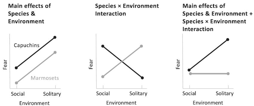
Things get really
interesting in the middle graph. Here, both factors matter, but each depends on
the other. If you’re a capuchin, being raised alone makes you bolder; if you’re
a marmoset, being raised alone makes you meeker. We see an interaction between
Species and Environment, which visually consists of the lines being
nonparallel. In these data, the lines cross into a perfect X, which means that
the main effects are canceled out entiTheoard,
Species doesn’t matter: in these data, the midpoint of the capuchin line sits
on top of the midpoint of the marmoset line. Environment doesn’t matter across
the board either: the average for Social, corresponding to the point midway
between the two leftmost tips, lines up with the average for Solitary,
corresponding to the point midway between the rightmost ones. Of course Species
and Environment do matter: it’s just that how each cause matters depends on the
other one. Finally, an interaction can coexist with one or more main effects.
In the rightmost graph, being reared alone makes capuchins more fearful, but it
has no effect on the always-calm marmosets. Since the effect on the marmosets
doesn’t perfectly cancel out the impact on the capuchins, we do see a direct
result of Species (the capuchin line is higher) and a primary effect on the
environment (the midpoint of the two left dots is lower than the midpoint of
the two right ones). But whenever we interpret a phenomenon with two or more
causes, any interaction supersedes the main effects: it provides more insight
as to what is going on. An interaction usually implies that the two causes
intermingle in a single link in the causal chain, rather than taking place in
different links and then just adding up. With these data, the common link might
be the amygdala, the part of the brain registering fearful experiences, which
may be plastic in capuchins but hardwired in marmosets. With these cognitive
tools, we are now equipped to make sense of multiple causes in the world: we
can get beyond “nature versus nurture” and whether geniuses are “born or made.”
Let’s turn to some real data. What causes major depression, a stressful event
or a genetic predisposition? This graph plots the likelihood of suffering a
major depressive episode in a sample of women with twin sisters.
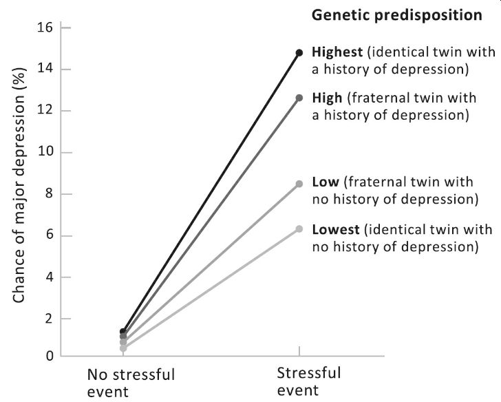
The sample includes
women who had undergone a severe stressor, like a divorce, an assault, or a
death of a close relative (the points on the right), and women who had not (the
points on the left). Scanning the lines from top to bottom, the first is for women
who may be highly predisposed to depression, because their identical twin, with
whom they share all their genes, suffered from it. The following line down is
for women who are only somewhat predisposed to depression, because a fraternal
twin, with whom they share half their genes, suffered from it. Below it we have
a line for women who are not particularly predisposed, because their fraternal
twin did not suffer from depression. At the bottom we find a line for women who
are at the lowest risk, because their identical twin did not suffer from it.
The pattern in the graph tells us three things. Experience matters: we see a
main effect of Stress in the upward slant of the fan of lines, which shows that
undergoing a stressful event ups the odds of getting depressed. Overall, genes
matter: the four lines float at different heights, indicating that the higher
one’s genetic predisposition, the greater the chance that one will suffer a
depressive episode. But the real takeaway is the interaction: the lines are not
parallel. (Another way of putting it is that the points fall on top of one
another on the left but are spread out on the right.) If you don’t suffer a
stressful event, your genes barely matter: regardless of your genome, the
chance of a depressive episode is less than one percent. But if you do suffer a
stressful event, your genes matter a lot: a full dose of genes associated with
escaping depression keeps the risk of getting depressed at 6 percent (lowest
line); a total amount of the genes related to suffering depression more than
doubles the risk to 14 percent (highest line). The interaction tells us that
both genes and environment are essential and that they seem to have their
effects on the sin the causal chain. These twins' genes and to different degrees
are not genes for depression per se; they are genes for vulnerability or
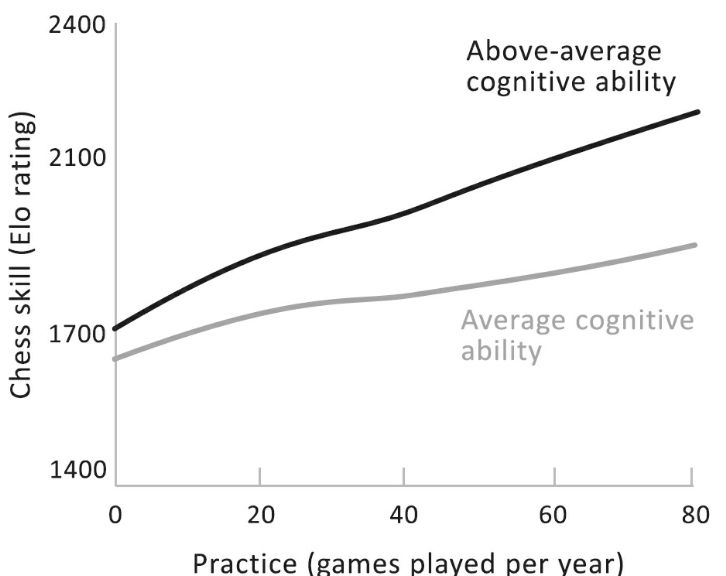
resilience to stressful experiences. Let’s turn to whether stars are born or
made. The graph on the next page, also from an actual study, shows ratings of
chess skill in a sample of lifelong players who differ in their measured
cognitive ability and in how many games they play per year. It shows that
practice makes better, if not perfect: we see a main effect of games played per
year, visible in the overall upward slope. Talent will tell: we see a main
effect of ability, visible in the gap between the two lines. But the real moral
of the story is their interaction: the lines are not parallel, showing that
smarter players gain more with every additional game of practice. An equivalent
way of putting it is that without practice, cognitive ability barely matters
(the leftmost tips of the lines almost overlap), but with practice, smarter
players show off their talent (the rightmost tips are spread apart). Knowing
the difference between main effects and interactions not only protects us from
falling for false dichotomies but offers us deeper insight into the nature of
the underlying causes.
Causal Networks and
Human Beings As a way of understanding the causal richness of the world, a
regression equation is pretty simpleminded: it just adds up a bunch of weighted
predictors. Interactions can be thrown in as well; they can be represented as additional
predictors derived by multiplying together the interacting ones.
Yet despite their
simplicity, one of the surprising findings of twentieth-century psychology is
that a dumb regression equation usually outperforms a human expert. The
finding, first noted by the psychologist Paul Meehl, goes by the name “clinical versus
actuarial judgment.” Suppose you want to predict some quantifiable outcome,
how long a cancer patient will survive; whether a psychiatric patient ends up
diagnosed with a mild neurosis or a severe psychosis; whether a criminal
defendant will skip bail, blow off parole, or recidivate; how well a student
will perform in graduate school; whether a business will succeed or go
belly-up; how large a return a stock fund will deliver. You have a set of
predictors: a symptom checklist, a group of demographic features, a tally of past
behavior, a transcript of undergraduate grades or test scores, anything that
might be relevant to the prediction challenge. Now you show the data to an
expert, a psychiatrist, a judge, an investment analyst, and so on, and at the
same time feed them into a standard regression analysis to get the prediction
equation.
Who is the more
accurate prognosticator, the expert or the equation? The winner, almost every
time, is the equation. An expert who is given the equation and allowed to use
it to supplement their judgment often does worse than the equation alone. The
reason is that experts are too quick to see extenuating circumstances that they
think render the formula inapplicable. It’s sometimes called the broken-leg
problem, from the idea that a human expert, but not an algorithm, has the sense
to know that a guy who has just broken his leg will not go dancing that
evening, even if a formula predicts that he does it every week. The problem is
that the equation already considers the likelihood that extenuating
circumstances will change the outcome and factors them into the mix with all
the other influences. At the same time, the human expert is far too impressed
with the eye-catching particulars and too quick to throw the base rates out the
window. Indeed, some of the predictors that human experts rely on the most,
such as face-to-face interviews, are revealed by regression analyses to be
perfectly useless. It’s not that humans can be taken out of the loop. A person
still is indispensable in supplying predictors that require real comprehension,
like understanding language and categorizing behavior. It’s just that a human
is inept at combining them, whereas that is a regression algorithm’s stock in
trade. As Meehl notes, at a supermarket checkout counter, you wouldn’t say to
the cashier, “It looks to me like the total is around $76; is that OK?” Yet,
that is what we do when we intuitively combine a set of probabilistic causes.
For all the power of a regression equation, the most humbling discovery about
predicting human behavior is how unpredictable it is. It’s easy to say that a
combination of heredity and environment causes behavior. Yet when we look at a
predictor that has to be more potent than the best regression equation, a
person’s identical twin, who shares her genome, family, neighborhood,
schooling, and culture, we see that the correlation between the two twins’
traits, while way higher than chance, is way lower than 1, typically around.6
That leaves a lot of
human differences mysteriously unexplained: despite near-identical causes, the
effects are nowhere near identical. One twin may be gay and the other straight,
one schizophrenic and the other functioning normally. In the depression graph,
we saw that the chance that a woman will suffer depression if she is hit with a
stressful event and has a proven genetic disposition to depression is not 100
percent but only 14 percent. A recent lollapalooza of a study reinforces the
cussed unpredictability of the human species. One hundred sixty teams of
researchers were given a massive dataset on thousands of fragile families,
including their income, education, health records, and the results of multiple
interviews and in-home assessments. The teams were challenged to predict the
families’ outcomes, such as the children’s grades and the parents’ likelihood
of being evicted, employed, or signed up for job training. The competitors were
allowed to sic whichever algorithm they wanted on the problem: regression, deep
learning, or any other fad or fashion in artificial intelligence. The results?
In the understated words of the paper abstract: “The best predictions were not
very accurate.” Idiosyncratic traits of each family swamped the generic
predictors, no matter how cleverly they were combined. It’s a reassurance to
people who worry that artificial intelligence will soon predict our every move.
But it’s also a chastening smackdown of our pretensions to fully understand the
causal network in which we find ourselves.
For updates click homepage here